
Planet Fitness is one of the largest and fastest-growing fitness franchise chains with over 1400 clubs 10+ million members in 5 countries.
I was the lead UX Designer responsible for redesigning Planet Fitness's corporate site, Franchising microsite, multiple promotional landing pages and redesigning their existing membership sign up flow. In addition we built a social member community to feature social content and valuable fitness resources . Since Planet Fitness is growing internationally we also developed a unique international strategy to localize content and site structure for their growing presence in Canada, Panama, Mexico, and the Dominican Republic.
Industry: Fitness, eCommerce
Acquia: How Planet Fitness Delivered a Modern, Digital Experience for Its Customers
Chief Marketer: New Website Helps Planet Fitness Strengthen Engagement
What We Did
10+ PF employee interviews
15+ PF franchisee interviews
10+ member interviews
Landscape analysis
Google Analytics reviews
Content audit
Sitemap development
30+ desktop & mobile wireframes
5+ in-person usability testing
10+ remote usability testing
Wireframe to Design

Goals

1. Develop Frictionless Join Flow
Develop a painless join process, regardless of the device type to increase the % of successful online conversions

2. Offer a Rewarding Membership Experience
Quickly identify existing members and serve valuable content that will help them engage with PF and become brand advocates

3. Empower Franchisees
Offer franchisees an easy self-service solution to create flexible, trackable local content that fits within PF's brand
Key Stakeholder Interview Insights
“Users should be able to join in 5 minutes so they dont put it off”
“We appeal to everyone — but our current site is not usable to everyone.”
“For 1st time members, we are competing with the couch… price is NOT the barrier.”
“We are completely missing the role of the site for current members today.”
“We dont care if people cancel.”
“Let’s get our brand beyond purple and $10/month… We have such diverse members!”
Uniting the Digital Ecosystem
One of our key strategic recommendations was to unite the Planet Fitness digital ecosystem so more integrations and flexibility were allowed on a single platform. We chose Drupal and used Acquia Lift to personalize the site based on how many times a user had been to the site and what they clicked on in their previous visits.


Competitive Analysis
We combed through PF's direct competitors (like Anytime Fitness & Lifetime Fitness), similar gyms in the fitness industry (like Equinox & Curves), and other best-in class subscription models (like ClassPass & Blue Apron) in order to identify PF's unique value proposition. We chose 5 key dimensions to analyze which relate directly to our main goal: get people to the site and get them to JOIN -- quickly and easily.

JOIN JOURNEY
How can we enroll new members who identify with the values Planet Fitness is built upon, with as little friction as possible?
BRAND EXPERIENCE
How can we accurately portray PF and its values to the type of prospects we want to attract?
FIND A GYM
How can we make it easy for users to find the closest gym to their desired location?
CLUB PAGES
How can we showcase the unique info users are looking for regarding each club location?
DESIGN
How can we assemble the content, components, colors and key messages into a unique and effective look/feel across touchpoints?

Key Target Audiences

We ended up breaking down our audiences even further by focusing on needs-based personas as it relates to converting new users via the website. During our user interviews we found there were 2 types of prospective members:
1. "I'll just join— it's only $10 a month!
Digital Needs:
Streamlined club locator
Quick and easy join process
Minimum required form fields
Consistent CTAs
Promotional content
Barriers to Joining:
Another gym came up during search process
Skeptical it’s too cheap
Another gym is in a similarly convenient location
2. "I need to see the club before I join"
Digital Needs:
Immersive 360 degree virtual tour of local club
Location-based club recommendation
Answers to FAQs
Friendly atmosphere shown using member stories and club imagery
Explanation of ‘judgment free zone’
Barriers to Joining:
Unsure if they’ll use the club
Unsure if they’ll fit in at the club
May not be comfortable with online payment
Responsive Wireframes

Mobile-First Approach
While we always design interfaces to be fully responsive and consider common mobile use cases, the Google Analytics for PF showed more than 75% of site traffic came from mobile users.
The data led to our designing the wireframes with a mobile-first, desktop second approach while also designing key tablet breakpoints as needed. Since the old site was barely responsive, we knew the mobile traffic would rise significantly as we optimized the site for mobile as well. In the end I designed over 30 desktop and mobile wireframes for the project as seen below.


While the client insisted on the 'Join' button being plastered all over the site, our interviews proved users were most concerned with PF having a convenient location close to where they live or work. That's why the main call-to-action button on the site's homepage is 'Find Your Club'. We explained that once users were on the club page of their choice, the calls-to-action all change to 'Join Now'. If users are ready to join at any point while on the site, they can easily convert via 'Join Now' button in the sticky header, a common best practice for software and consumer-focused sites alike.
On the Find Your Club page we made it easiest for the user to find their preferred club location by enabling geolocation and IP detection. We also learned it was extremely important for the franchisees to have access and authority to customize their own Club Pages so each page is made up of modular components that can be edited by the franchisees themselves. The components include unique description amenities, photo galleries, and promotions. The franchisees know their locations, members, and prospective members better than anyone at the PF headquarters does, especially in international markets.

Find Your Club

Customizable Club Page


Social Community@PF
Based on user research and surveys sent to 10's of 1000's of current Planet Fitness members, we learned what members were looking for from their membership and how the new digital ecosystem could improve their engagement with Planet Fitness as a brand.
Many users noted they were interested in learning from or receiving encouragement from other members who had similar fitness goals to them. We recommended Planet Fitness start by creating a community section for their site users which aggregated content from multiple sources.


Recommended Community@PF Content:
1. Educational content (i.e. workouts and wellness tips) members claimed they wanted to learn about
2. Promotional ads featuring the latest membership flash sale
3. PF's heavily trafficked Instagram, Facebook, and Twitter content
By letting users explore tips, inspiration, hacks, and how-to's related to the gym (and unrelated to the gym), we tried to extend the judgement-free feeling users get when entering their local gym. I worked closely with our content strategists to develop 6 categories that users could choose from based on where along their fitness journey they identified with. The final categories were: 'Get Started', 'Keep it Going', 'Find Balance', 'Get Inspired', 'Eat Well', and 'Workout'. We received input from both our current members and SEO strategists and to decide on the final terms.

Component Library
Since the project had lots of moving parts and we worked collaboratively with the client over multiple weeks, I developed a component library to ensure our developers worked with the latest iterations of components and naming conventions.


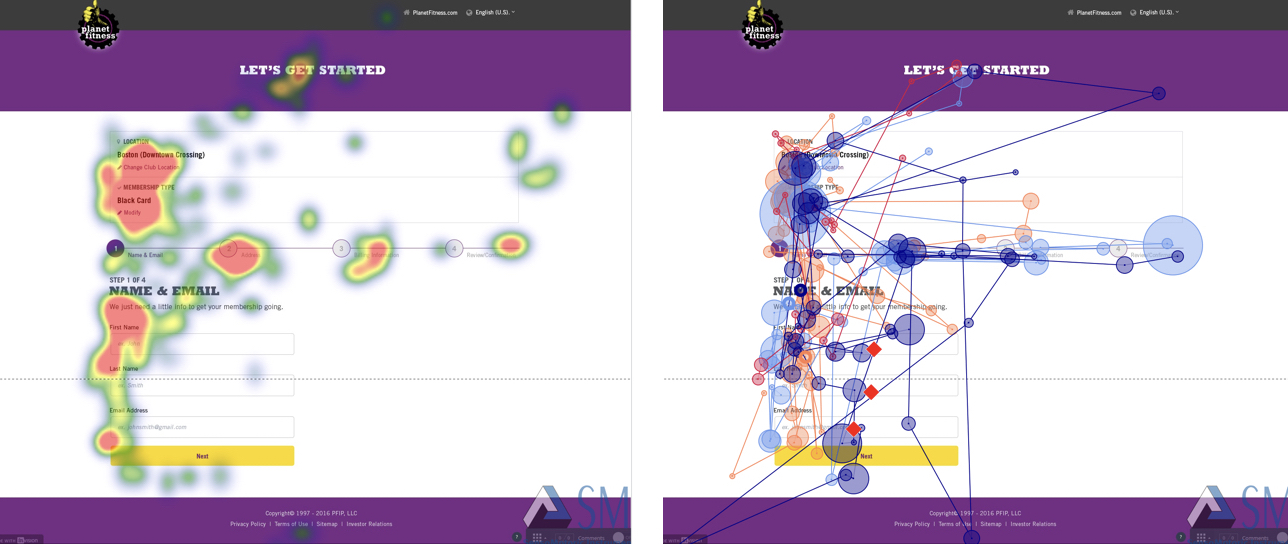
Usability Testing
I led the usability testing for 10+ remote users and 5+ in-person tests in our on-site eye-tracking lab. We had two key use cases we wanted to test:
1. Finding a club that the user wants to join (from the homepage)
2. Joining that club and becoming a member online (from the club page)

Each round of testing produced overall positive and consistent results. We made slight design tweaks based on common themes we heard from multiple users. There were a few concepts we realized it was essential for a user to understand in order to create a successful join experience including:
1. Understanding which of the 1,000's of club locations they were joining before paying
2. Understanding which membership they signed up for (and if they have access to one or all clubs)
3. Understanding what fees the user would be charged for, during which month, and why (transparency is key)
Conversion Flow Redesign


Due to confidentially restraints I'm not able to disclose details of specific business challenges and our solutions. Contact me for a more in depth explanation of our thinking process and reasoning.
